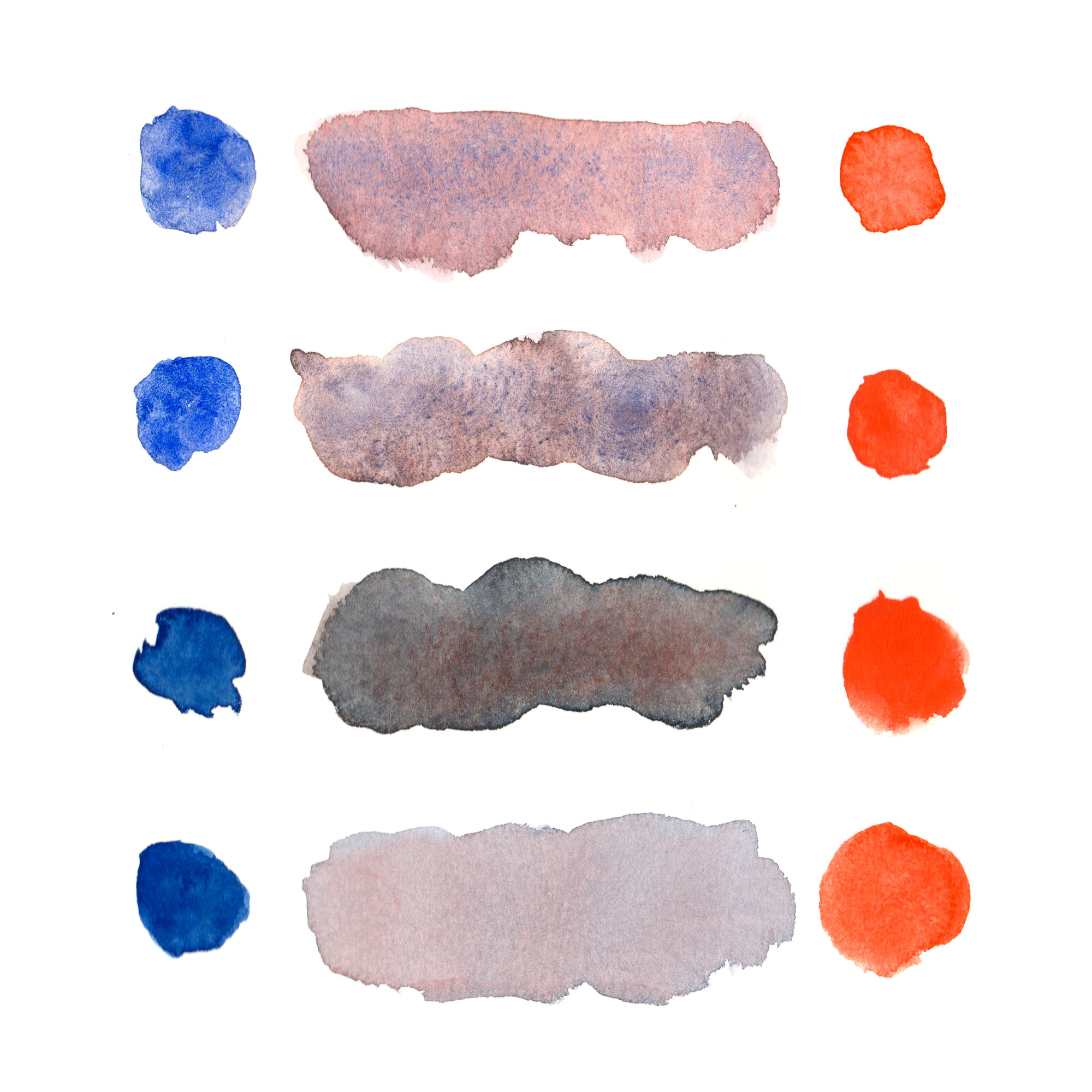
Examples of watercolor granulation (or lack thereof).
In watercolor, granulation is that crackly, noisy texture you see in some washes of paint after they've dried on the paper or in your palette.
This usually (though not always) is the result of the pigment particles in the paint being large, heavy, magnetic, and/or uneven in size. They have a tendency to settle together in patches as opposed to spreading evenly across the page, and that's why you get those crackly textures.
Usually, inorganic pigments tend to granulate, and organic ones don't. It's a little more complicated than saying "stuff from rocks and metals creates granulation, and things that were made to imitate dyes from plants and animals are non-granulating (also, these synthetic organic pigments tend to have scientific sounding names like phthalocyanine and benzimidazolone and quinacridone and diketopyrrolopyrrole)", but that's the rough gist of it.
Some popular granulating pigments are:
- Ultramarine Blue: Usually your first exposure to granulation, since it's a popular blue.
- Earth Pigments, especially Burnt Umber, Red Iron Oxide, and Mars Black: Pretty common in landscape painter palettes.
- Cadmium and Cobalt Pigments: The brightness and opacity of Cadmium Scarlet and Cobalt Turquoise Light is hard to imitate with other pigments.
- Potter's Pink: A subdued color, but granulates very strongly.
- Volcano Yellow: Schmincke's name for Zirconium Praesodymium Silicate Yellow, which is found in a lot of their granulating mixes.
Making Interesting Mixes
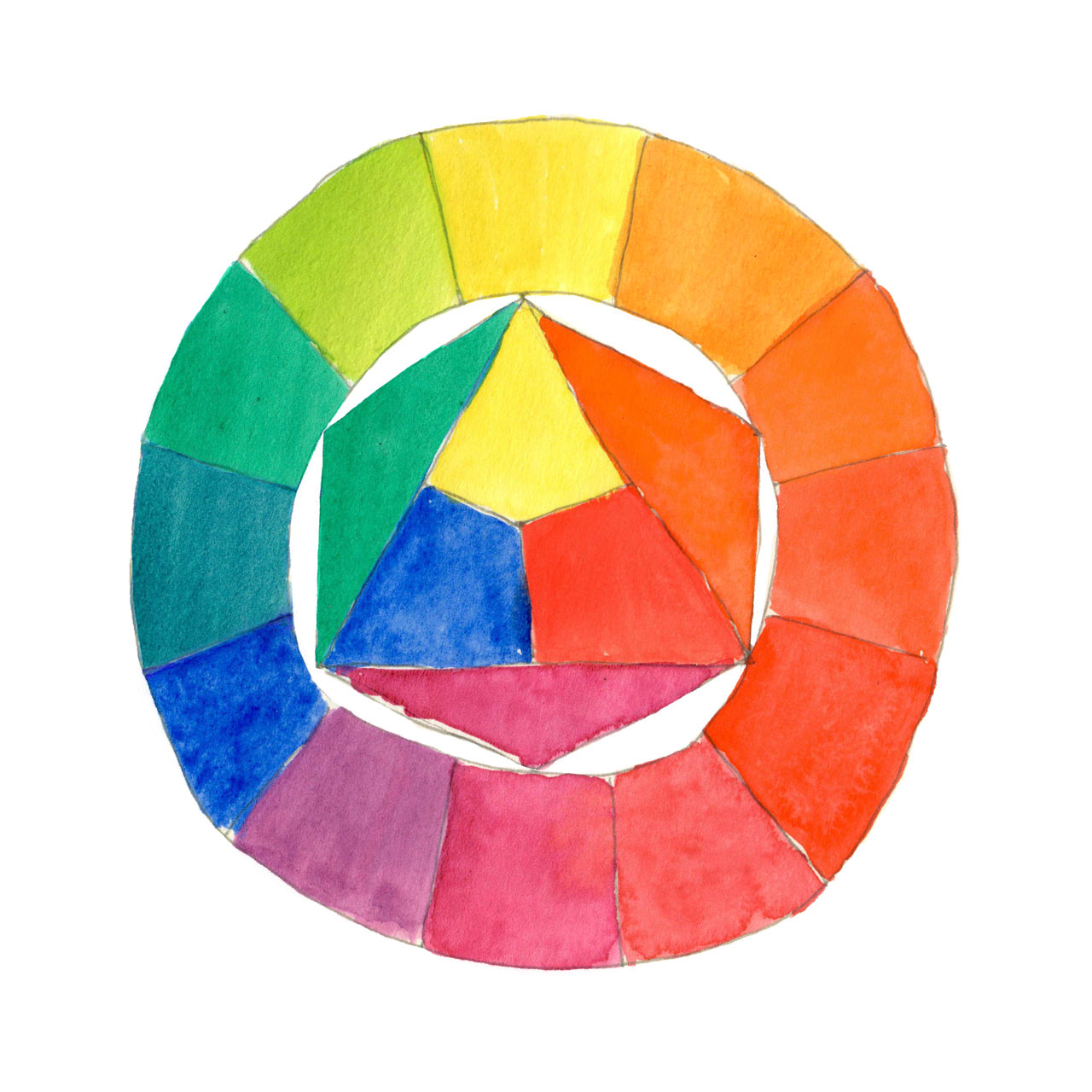
A color wheel to help you find opposite hues.
A simple way to make this quality of watercolor even more interesting is by mixing two paints with distinct qualities: for example, a granulating paint of one hue, and a non-granulating paint of the opposite hue.
Here are the paints I used in the example at the top of this post.
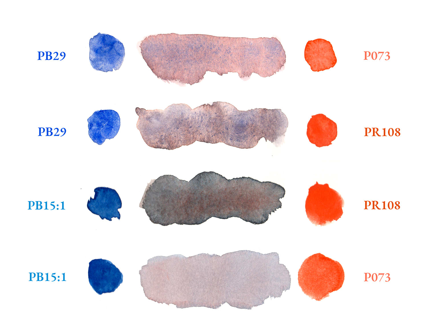
Orange and red watercolor mixes, with pigment numbers.
Granulating:
- Blue: Ultramarine (Pigment number PB29)
- Orange: Cadmium Scarlet (Pigment number PR108)
Non-Granulating:
- Blue: Phthalo Blue, Red Shade (Pigment number PB15:1)
- Orange: Pyrrol Orange (Pigment number PO73)
This works best with dark granulating pigments and light non-granulating pigments, but it can also work the other way around if the light granulating pigment is opaque enough.
You can also look at what pigments are used in paints that are advertised as granulating. Daniel Smith's "Cascade Green" is PBr7 (Brown Iron Oxide) and PB15 (Phthalo Blue, Green Shade), which are two colors you may already have on your palette. You can play off of that combination and make an interesting mix with similar pigments, like PR101 (Synthetic Red Iron Oxide) and PG7 (Phthalo Green, Blue Shade).
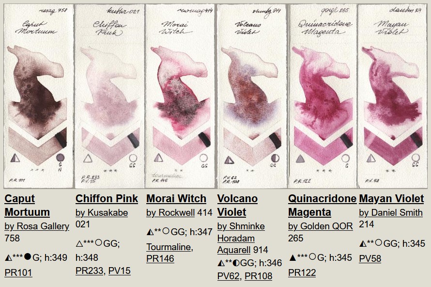
Screenshot from Watercolor Dragons' Granulating Swatches.
Another way is to find pigments and mixes that call to you on a dedicated swatch site, like Watercolor Dragons. Some people run watercolor blogs where they occasionally swatch paints and write down the brand and/or pigment numbers (like this post!), though they're usually not as extensive and organized as a site like Watercolor Dragons.
Some Final Advice
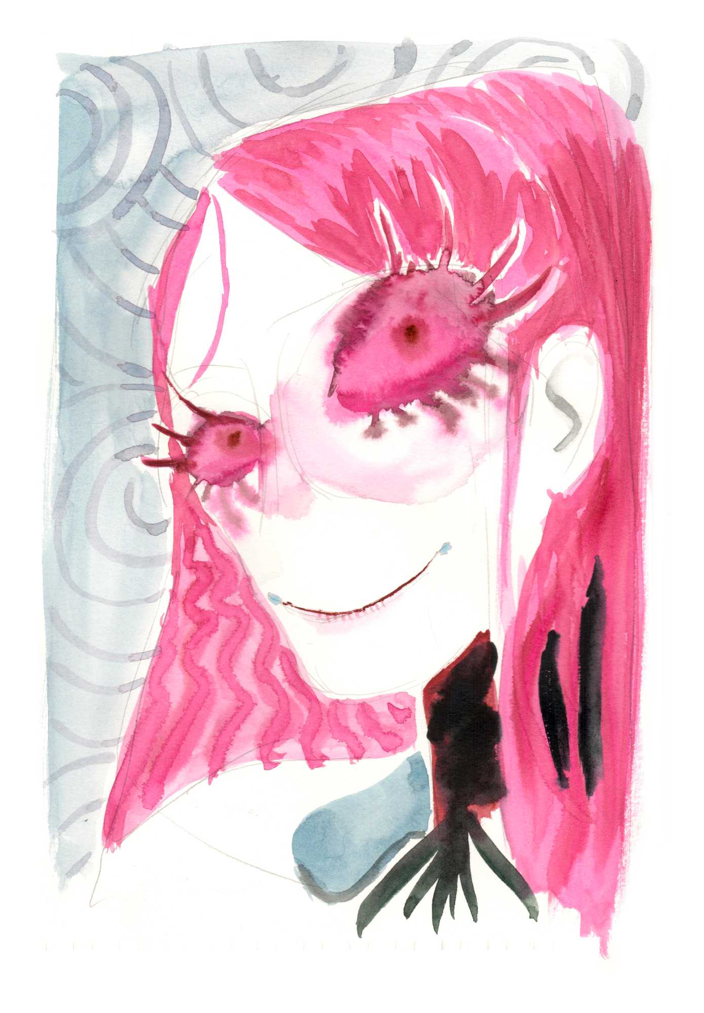
Sugar Puppet from Money for Girls: Amortized, with a heavy dry-on-wet and wet-on-wet effect in her eyes and hair.
Techniques like granulation, wet-on-wet, and dry-on-wet work best with watery washes and sized paper that does not absorb all of the water really quick. Otherwise, the pigments won't get enough time to move around and settle together in patches.
For the best experience, you should use a paper specifically for watercolor (ideally 100% cotton and well sized), but I have had good success with Legion Stonehenge paper (a printmaking paper, which is what I used for the swatches and paintings on this post), and Strathmore 400 Heavyweight Drawing paper (a wood pulp paper). As long as the paper is properly sized for wet media, and you use enough water, you can get a nice effect on hot press, cold press, rough, and non-watercolor papers.
Additionally, these techniques stand out the most if other parts of your image are more flat. For instance, granulation would be great for rendering things like rosacea, or creating an exaggerated and stylized version of a wool sweater. These textures may lose their impact if the rest of the image is painted with a high amount of detail and contrast, though. In those areas, you can instead opt to use non-granulating paints and large, flat shapes.
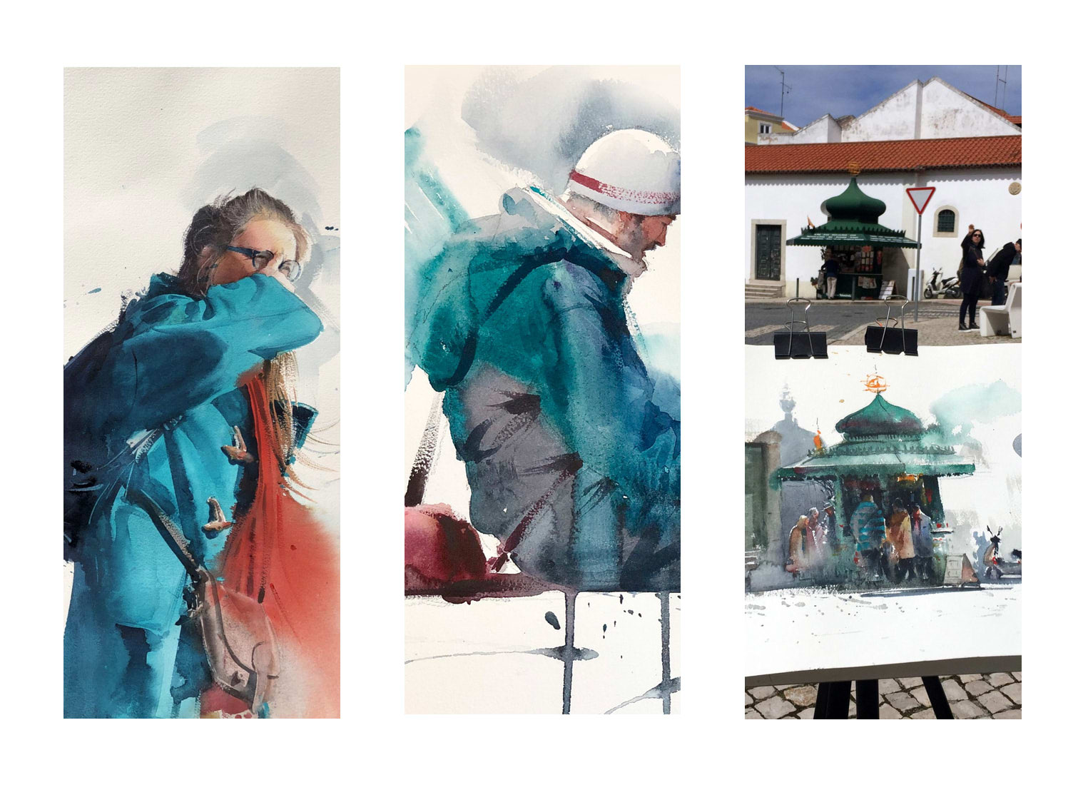
Paintings from Eudes Correia's portfolio.
Eudes Correia is a contemporary watercolor master who is highly regarded for his ability to paint realistic portraits and landscapes that suddenly fall away into abstraction and negative space. His work may be a good lead on how to use these techniques creatively.
If this post piqued your interest in watercolor, you may find this intro to watercolor I wrote a while back useful.